The Story Behind Skin Tone Emojis

Open up your emoji keyboard today, and you’ll find a sea of choices — faces laughing, crying, frowning, winking — all in different shades of skin tone. You might scroll through without giving it much thought, but this wasn’t always the case.
When emojis first went mainstream, they were fun and expressive, sure, but they weren’t exactly… diverse. In fact, if you go back just a decade, the “people” emojis pretty much all looked the same. No matter your background, you were stuck using the same default tone — a light, yellow-ish shade — to represent yourself.
It might have seemed harmless to some, but to others, it was a constant reminder: this universal language didn’t quite see everyone.
So how did we go from one generic shade to a spectrum of options? The answer takes us from Japan’s early emoji designs to dermatology charts, tech boardrooms, and one of the biggest inclusivity updates in emoji history.
Before Skin Tone Options – A “One-Size-Fits-All” Problem
In the late 1990s and early 2000s, when Japanese phone carriers first rolled out emojis, most human figures were bright yellow — partly to avoid racial specificity and partly because it kept things simple for tiny pixel grids.
When Apple introduced emojis to iPhones in 2011 (and later Android), they kept that same look. Yellow was considered “neutral,” but in reality, it wasn’t neutral at all. It was just the default.
For people who didn’t see themselves in that color, it felt limiting. Imagine trying to express yourself through tiny digital characters… and none of them actually look like you.
The more emojis became a part of everyday communication — from tweets to Instagram captions to workplace messages — the more glaring the lack of diversity became.
How Change Began – The Push for Representation
The shift didn't happen overnight. Individuals began discussing it on social media, tech authors covered the issue of diversity with emojis, and activist organizations pushed for more diverse designs.
Around 2014, Apple publicly stated that they were tackling the issue by collaborating with the Unicode Consortium (the nonprofit organization that standardizes emojis) to bring in more diversity. This was a big deal — Apple’s influence meant other major platforms would likely follow suit.
The Fitzpatrick Scale – From Dermatology to Digital Icons
Here’s where things get interesting. Unicode needed a way to represent skin tones that was fair, standardized, and worked globally. They didn’t want to invent something arbitrary, so they turned to an existing medical classification: the Fitzpatrick scale.
Created in the 1970s by dermatologist Thomas B. Fitzpatrick, the scale was originally designed to classify human skin by its reaction to UV light. It has six types, ranging from very light (Type 1) to very dark (Type 6).
For emojis, Unicode adapted this into five skin tone modifiers, plus the original yellow “default” option:
1️⃣ Light Skin Tone
2️⃣ Medium-Light Skin Tone
3️⃣ Medium Skin Tone
4️⃣ Medium-Dark Skin Tone
5️⃣ Dark Skin Tone
This meant any person emoji could now be paired with one of these tones, without needing separate icons for every combination.
The Technical Side – How It Works
Every “person” emoji still has a base character — for example, 🧑 Person→ or 👍. The skin tone is applied using a modifier code that follows the base emoji.
Think of it like digital layering:
- Base emoji = the shape and design
- Modifier = the skin tone
When you choose a tone, your device combines these two instantly. This approach keeps keyboards organized while still giving you freedom to choose how you appear.
The Big Release – 2015’s Diversity Update
Early in 2015, skin tone modifiers became part of Unicode 8.0. Apple released them in iOS 8.3, and overnight, there were millions who felt they had an emoji that better represented themselves.
It was the moment of turning for online representation. The news media called it one of the largest emoji overhauls ever, and social networks went crazy as people played with the new tones.
Why It Mattered (And Still Does)
Representation in emojis isn’t just about visuals — it’s about being seen. When you can pick an emoji that reflects your skin tone, it’s a subtle but powerful statement: I’m part of this conversation, too.
It also has ripple effects:
- Encourages cultural awareness
- Normalizes diversity in digital spaces
- Helps avoid awkward misinterpretations
For example, before skin tones, a 👍 Thumbs Up→ was just… a thumbs-up. Now, choosing a tone adds an extra layer of personal connection.
The Controversies and Growing Pains
Of course, the change wasn’t without debate. Some argued that skin tone options could encourage stereotyping, while others worried about people intentionally using the “wrong” tone. Unicode’s stance was that giving people the choice was the most inclusive option — and that intent matters more than policing usage.
There was also an adjustment period. Some users stuck with yellow out of habit, while others embraced skin tones instantly. Over time, they became a natural part of online communication.
Where We Go From Here
Skin tone options opened the door for more conversations about representation in emojis. Since then, Unicode has added gender-inclusive emojis, cultural clothing (like 🧕 Woman With Headscarf→ and 🥻 Sari→), and accessibility-related icons (👨🦽 Man In Manual Wheelchair→, 🦯 White Cane→).
But the work isn’t done. Advocates are pushing for more accurate hair textures, more regional foods, and better representation of Indigenous cultures. Emojis will keep evolving — because the people who use them will keep evolving, too.
💡 Explore Every Skin Tone Emoji
Want to see them all? Browse All Emojis on our site, copy your favorites, or mix them into creative combos that reflect who you are.
Because in the end, emojis aren’t just tiny pictures.
They’re little mirrors of our world — and the more accurately they reflect us, the better our digital conversations become.
Share this article
Help others discover this content
Related Articles
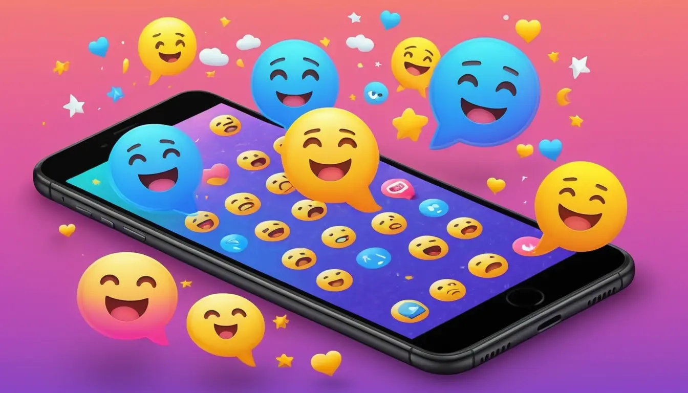
Top Emojis of 2025
From ❤️ to 🫠, these are the emojis dominating 2025—and what they reveal about how we’re feeling, communicating, and emotionally surviving the internet.
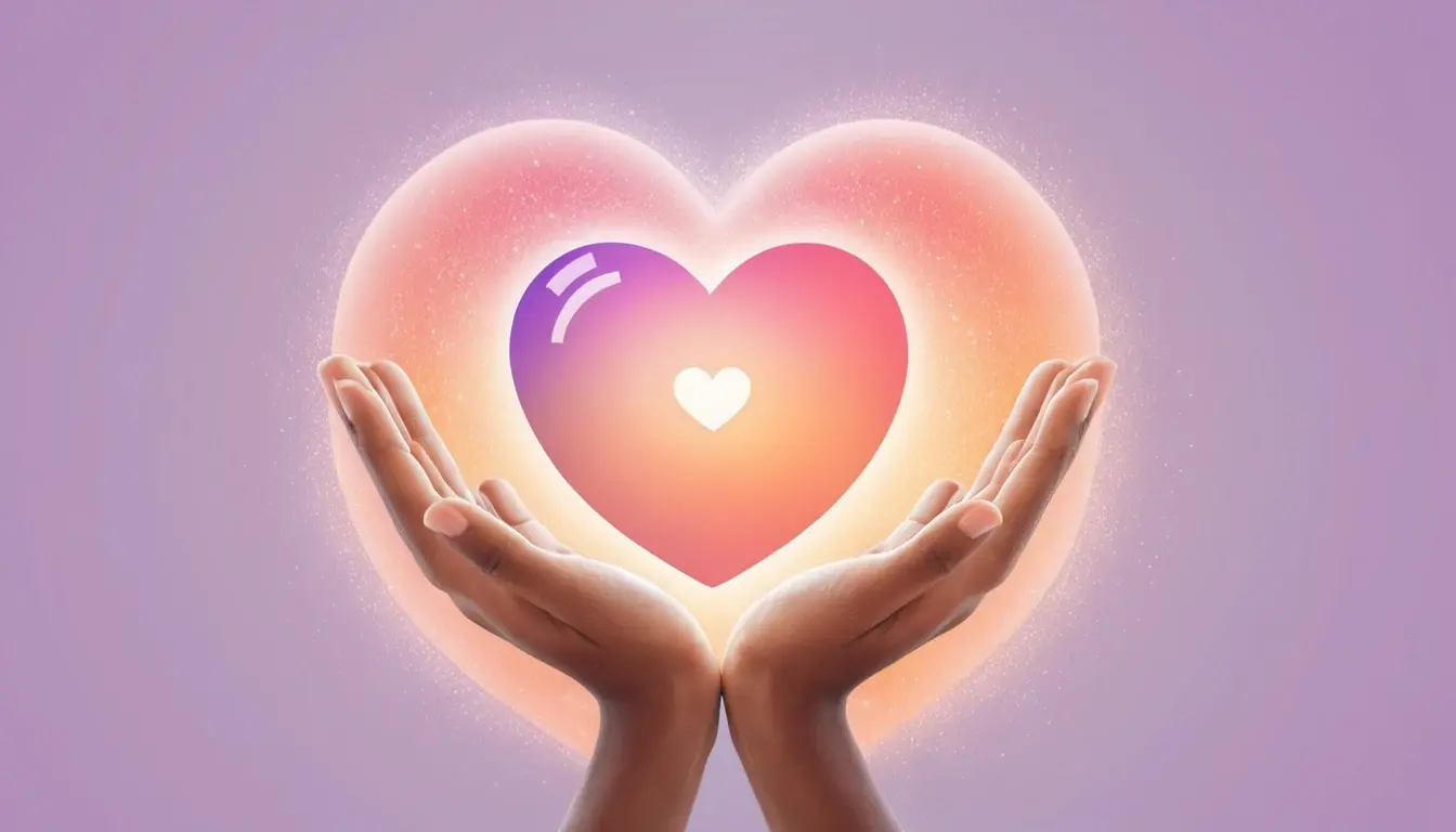
What Does Heart Hands Mean? Explaining Viral Emoji Trends
The 🫶 emoji is everywhere—but what does it really mean? From soft affection to digital solidarity, we explore why this heart-hands symbol has quietly taken over online conversations in 2025.
How Emojis Are Designed and Approved by the Unicode Consortium
Who decides what emojis make it to your phone? It’s not just Apple or Google — it all starts with a formal proposal, a review process, and a final Unicode decision. Here’s how a juice box becomes a global symbol.